Using inspiration to create something original
inspiration: ANDY WARHOL
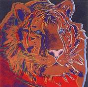
As the image to the left shows, Andy Warhol has adapted his original pop art style and turned it into something completely original. The bold lines contouring the tigers face add structure which causes the image to make more sense, however the fact they are green, yellow, blue and red make the tiger seem artistic and original. Also, this varies from his usual pop art as the colour which dominates the face (orange in this case) is not a full colour, it differs in shade and texture. Andy Warhol's work appears to be inspired by Roy Lichtenstein's earlier pop art, there are striking similarities in their portrait work however this piece in particular Andy Warhol has took elements from pop art and applied them in his own way such as the colour tone, bold lines and composition. It is this which I decided I wanted to incorporate within my own photographs.


MAN RAY
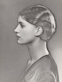
Man Ray's portrait photographs typically consist of a model with a simple facial expression, and he often uses shadowy effects and the natural shapes of the hands and body to create diverse shapes and angles.It is clear that from his time living in France, he developed a love for the surrealist style due to the popular boom of surrealism art. This is reflected in his work, as he uses screening to develop his photographs and create a very unique monochrome tone with a soft shadow around the models body and features. This is the element of Man Ray's photograph which I wanted to incorporate in my own work.
my original work

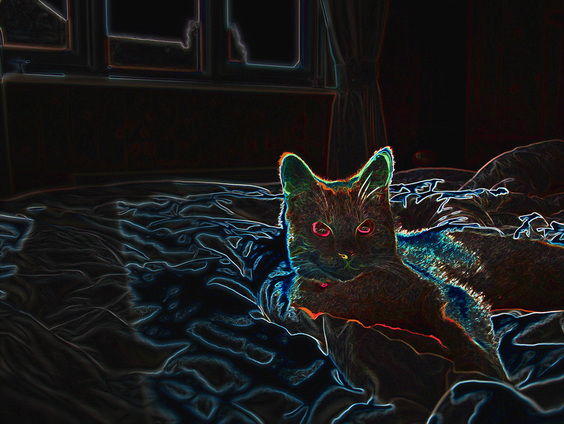
In this photograph, I decided to take elements of the Andy Warhol tiger picture and twist it into something original. The process in creating this involved firstly adding a duplicate copy of the background so anything I adjusted can be erased without causing distortion to the image if I didn't like it. Once the layer was made, I then adjusted the 'brightness and contrast' sliders, so the right amount of detail was exposed. This was important as when I were to apply the effects, I needed a correctly exposed photograph to enable the best quality editing. Afterwards, I created a layer mask on the eye in order to further adjust the exposure of this area as I wanted it to look brighter- again this meant the rest of the image was not effected. The next step involved applying the effects which complete the image. when I used "glowing edges" it added sketchy textures to all of the lines and contours in the photograph, I think that this makes the photograph seem more like art in drawing or painting form rather then an ordinary picture. Next, I added another layer to alter the saturation of the photo, this meant I could change the colour tones of the whole image until it reaches the desired mood. I decided to use the blue/pink/yellow/orange tones as it makes my subject seem surreal in the sense that it is no ordinary cat, an aspect of my image that I like. Next, I created a final layer and used a very small soft brush to add in bold contour lines- this can be noticed around the bottom of the eye and pupil, and through the whiskers and fur. This helped to outline his face better, and again made the eye stand out and appear very colourful and striking.
I incorporated features of both Andy Warhol and Man Ray's work into this of photograph; the sketchy drawing-like style and vibrant use of colours that Andy Warhol uses, along with a simple composition, with a similar glowing outline and surrealist mood that Man Ray expresses.
I incorporated features of both Andy Warhol and Man Ray's work into this of photograph; the sketchy drawing-like style and vibrant use of colours that Andy Warhol uses, along with a simple composition, with a similar glowing outline and surrealist mood that Man Ray expresses.
I used the same technique when manipulating this image, taking extra precaution to maintain a suitable exposure from taking the photos to manipulating them. This was achieved by using a balance of complementing ISO, shutter speed and Aperture. For example this particular photograph was shot using an ISO of 100, as the room was very well lit I did not want excess noise in the photo which would become apparent when re touching it.
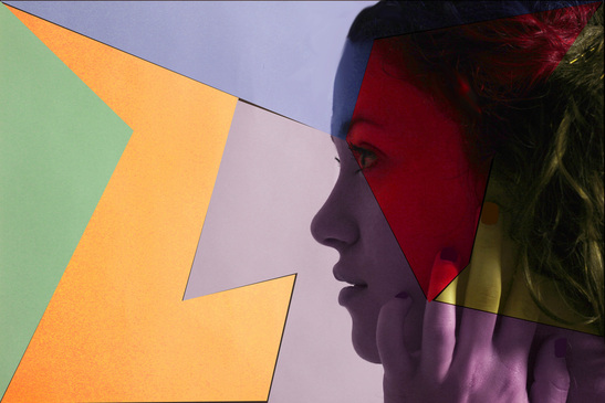
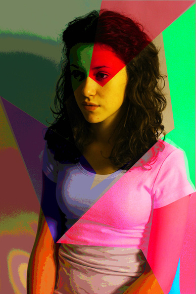
As this photograph shows, I decided to aspire to Andy Warhol's work and incorporate elements of his photographs into my own style to create something unique. The main element I wished to aspire to was the bright colours used to make Warhol's subject appear very contemporary and diverse, and incorporate the element of Man Ray's composition into it such as his affinity for using hands and interesting body shapes in his photographs.
The composition and exposure was a very important factor in achieving the best results I could; I decided to position my model facing outwards and take the photo in landscape orientation which gives more room for creativity later rather then her face being in the whole frame. Although this photograph turned out quite dark after taking it, I had took the image in RAW which meant I had the potential for maximum creativity and adjusted the white balance, brightness, contrast and levels to correctly expose it so when it came to adding effects to each section the features weren't lost and washed out.
When manipulating this photograph it was important to create each layer in an angular and scattered manor, so the colours didn't appear too organised nor precise. This is an element I had analysed from Andy Warhol's photographs, I think it is a more effective and interesting way to present portrait photographs in advertising and magazines rather then straight forward composition and colour schemes, as they are far more eye catching and artistic.
Achieving this kind of photograph involves creating multiple layers for each section that I wish to distort. For each layer, I adjusted the levels, saturation and brightness and on a few, effects such as "posterize" were applied. I think this shows how art and photography can co-exist along side one another; without Roy Lichtenstein, Andy Warhol and Man Ray's influence upon art and photography many wonderful creations we have today may not of been around.
In this particular photograph, the angles I created with each shape and colour are significant when evaluating it's overall impact; without them it could simply be a plain photograph with no apparent striking qualities. However with them I think it does my model and the overall image justice, it sets a bright and edgy mood to the photograph rather then simply no meaning at all. Of course, other elements help to create mood such as the positioning and stern expression on my models face; her eyes are centred and in the top sector of the frame making them the more obvious focal points. But overall the way the lines are drawn down her face sectioning it and break the photograph up into different colours draws attention to it and gives it a surreal, animated feel. Small detail can also be responsible for the eye catching quality of the photograph, such as the posterisation of the arms and t shirt, as it again breaks the image up into sections and has a textured look about it.
In this particular photograph, the angles I created with each shape and colour are significant when evaluating it's overall impact; without them it could simply be a plain photograph with no apparent striking qualities. However with them I think it does my model and the overall image justice, it sets a bright and edgy mood to the photograph rather then simply no meaning at all. Of course, other elements help to create mood such as the positioning and stern expression on my models face; her eyes are centred and in the top sector of the frame making them the more obvious focal points. But overall the way the lines are drawn down her face sectioning it and break the photograph up into different colours draws attention to it and gives it a surreal, animated feel. Small detail can also be responsible for the eye catching quality of the photograph, such as the posterisation of the arms and t shirt, as it again breaks the image up into sections and has a textured look about it.
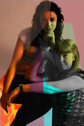
Again, almost identical techniques were used to develop this photograph however due to different colour tones and shapes it has a different mood and effect. Firstly, I used two models in the image this time which gave me the ability to experiment with more angles and compositions. Shape seems so significant when I'm creating this style of image, due to the complexity of the colours and shapes created in the manipulation it is important to have my model posed in a certain way so she isn't lost within all the colour and shape that was laid over the top. For example, I corrected there arms so it came across softer and fluent diagonally down the frame; however with there heads resting on there hands it still seems quite strong and focused especially with the eye contact to the camera.
This photograph required a few touch ups, such as the chair leg that my model was sitting on looked quite messy in the corner of the image; so I erased it using the colour sampler, brush then "blur" tool. Also, both of my models had stray hair which made the photograph a bit less professional and neat looking, so I used the same cover up technique to erase that also.
This photograph required a few touch ups, such as the chair leg that my model was sitting on looked quite messy in the corner of the image; so I erased it using the colour sampler, brush then "blur" tool. Also, both of my models had stray hair which made the photograph a bit less professional and neat looking, so I used the same cover up technique to erase that also.
