reflecting the style of andy warhol.
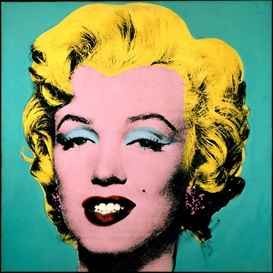
This image produced by Andy Warhol was achieved through the method of screen printing. This is when woven mesh is used to support an ink-blocking stencil to receive the image, then ink is transferred through open areas of the mesh which can be pressed through. Although Warhol used ink in his time as an artist, the same kind of effect can be achieved using modern editing software such as Photoshop. However, it is arguably never as successful as Warhol's original work as although we can "emulate" the style, the vibrant colours and sketchy textures created through the use of actual ink and stencils produces a unique style which is hard to reproduce precisely through digital techniques.
Other artists throughout the 60's used screen printing as a means of expressing their work, such as Rob Ryan and Roy Lichtenstein. However compared to Andy Warhol, there work is far less realistic and simple.
Other artists throughout the 60's used screen printing as a means of expressing their work, such as Rob Ryan and Roy Lichtenstein. However compared to Andy Warhol, there work is far less realistic and simple.
My own version
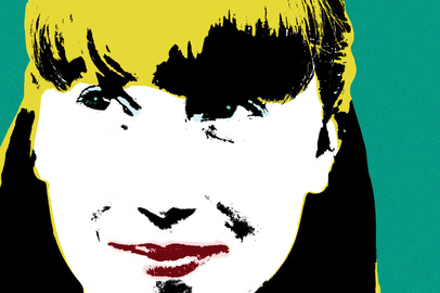
Although the methods I used were different from Andy Warhol's original work, I used the tools within Photoshop as efficiently as I could to emulate his style. Firstly, it was important to ensure I had a well composed and lit photograph just as Warhol had, so it looks as precise and detailed as possible. The following step was to create a layer mask of the background, so I could manipulate it without effecting the rest of my photograph. This is how I changed it into the greeny/blue which Warhol has used in his own work. However, I felt block colour looked too precise and modern compared to Warhol's so I adjusted the grain very subtly so it had more texture rather then a prefect even colour. One of the most important steps when developing the photograph was adjusting the Threshold so my models face was outlined in black and white, which sets the foundations for which parts shall be changed colour. This definitely helped to eliminate the photographic look of the picture, and turn her into something resembling a drawing which in itself adds to the surrealist style which I was trying to emulate.
The most tedious part of manipulating the photograph came next, which was selecting each section using the magic wand tool and changing the colour of them with a small brush. I felt the colours which Warhol chose were intentionally picked to make the image cool and contrast one another, the blue background causes Marilyn's yellow hair and pink skin to stand out so boldly it looks even more like a painting. The detail which I added last such as a slight blue above the eyelid and the blue tones in her eyes were to add detail back into the image as Warhol did. Although it looks somewhat like a painting, it still has photographic detail.
The most tedious part of manipulating the photograph came next, which was selecting each section using the magic wand tool and changing the colour of them with a small brush. I felt the colours which Warhol chose were intentionally picked to make the image cool and contrast one another, the blue background causes Marilyn's yellow hair and pink skin to stand out so boldly it looks even more like a painting. The detail which I added last such as a slight blue above the eyelid and the blue tones in her eyes were to add detail back into the image as Warhol did. Although it looks somewhat like a painting, it still has photographic detail.
Warhol's:
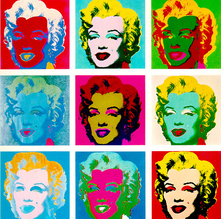
In this piece of work, Andy Warhol has used the same image but changed the colours and inverted them in order to gain 9 completely different images and present them in a repetitive manor. By looking at this, it's easy to see how much the colours can change the overall mood of each image. The repetitive style which Warhol exhibits in this piece was not a one off, he often used the same technique but usually with simple everyday objects: such as the soup can. At the time, this style was almost completely unseen and it broke the barriers that stood between popular culture and art, one of the main reasons pieces like this one are so famous.
My own version
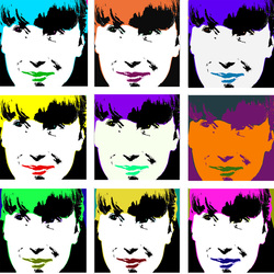
In order to recreate Warhol's piece I had to first create a photo-grid on Photoshop so each photograph I placed were perfectly in line with each other. For each image, in order to change the colours I had to adjust the levels of the Saturation and Hue which changes the tones of every image.
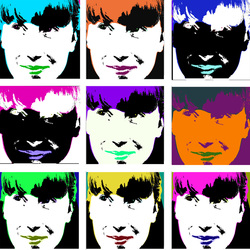
I slightly tweaked two of the photographs within this, (top right, middle left) and inverted them so they appear negative. This is because Warhol has similarly done this, and i personally think it adds to the abstract feel of the whole image.
